
One Room Challenge – Henry’s Room Plan (Week 1)

The wee man himself - Henry
It’s official, the One Room Challenge (ORC) has finally begun!! Hoorah! All of the featured designers hand-picked by the event organiser Linda Weinstein, have all posted and revealed their rooms and plans which is so very exciting to see – go check them out here. Some of my favourite people to follow on Instagram are featured designers this round and I can’t wait to see what they do!
If you’re new to Brooks & Stone - then welcome! Find out a little more about our 1929 Tudor here, and some random stuff about us here. I’ve decided in all my lengths of crazy to attempt getting THREE(!) separate rooms completed in the space of these eight weeks, including our two individual children’s rooms and our kitchen. We’ve not yet moved into our Tudor, so we’re using the ORC as our impetus to get our ‘essential spaces’ completed so we can finally move in. It’s going to stretch us to our limits, but ultimately we work best with a deadline and if we fail, oh well, at least we tried!
Given the in depth explanations needed for each room, I’ve decided for this first week to do a separate post per room to detail the before photos, the challenges, the plan and the honking to-do lists associated with each room. From ORC Week 2 onward, it’ll be easier to do a single post each week consolidating those seven days of activity for all three rooms. And if you missed my initial pre-challenge post explaining more about the One Room Challenge premise in general, a little about the kids’ personalities, the floor plan of where the rooms are in the house, and the muses/inspirations behind the designs, then please check out this post first! Finally, we wanted to get all of this work done in real-time during the eight weeks, so up until now we have attempted to just get each of the three rooms to a blank state, a canvas ready for the big guns!
So let’s start with Henry’s room. It’s the “simplest” and smallest of the three spaces (although it sits directly above the kitchen, so arguably is the same size). It is a southern facing room so is bathed in gorgeous light for most of the day by the three windows at the end of the room.
THE BEFORE PICTURES
This used to be a guest room (for the house’s previous occupants), and we were *this close* to getting the stunning and original Queen Anne style four-poster bed that sat in it, but sadly the family decided they wanted it after all at the last minute. #weepsuncontrollably Unfortunately, I only have one terrible picture of that bed when we viewed the house for the first time… but the rest are empty house photos I took a few days after we closed:

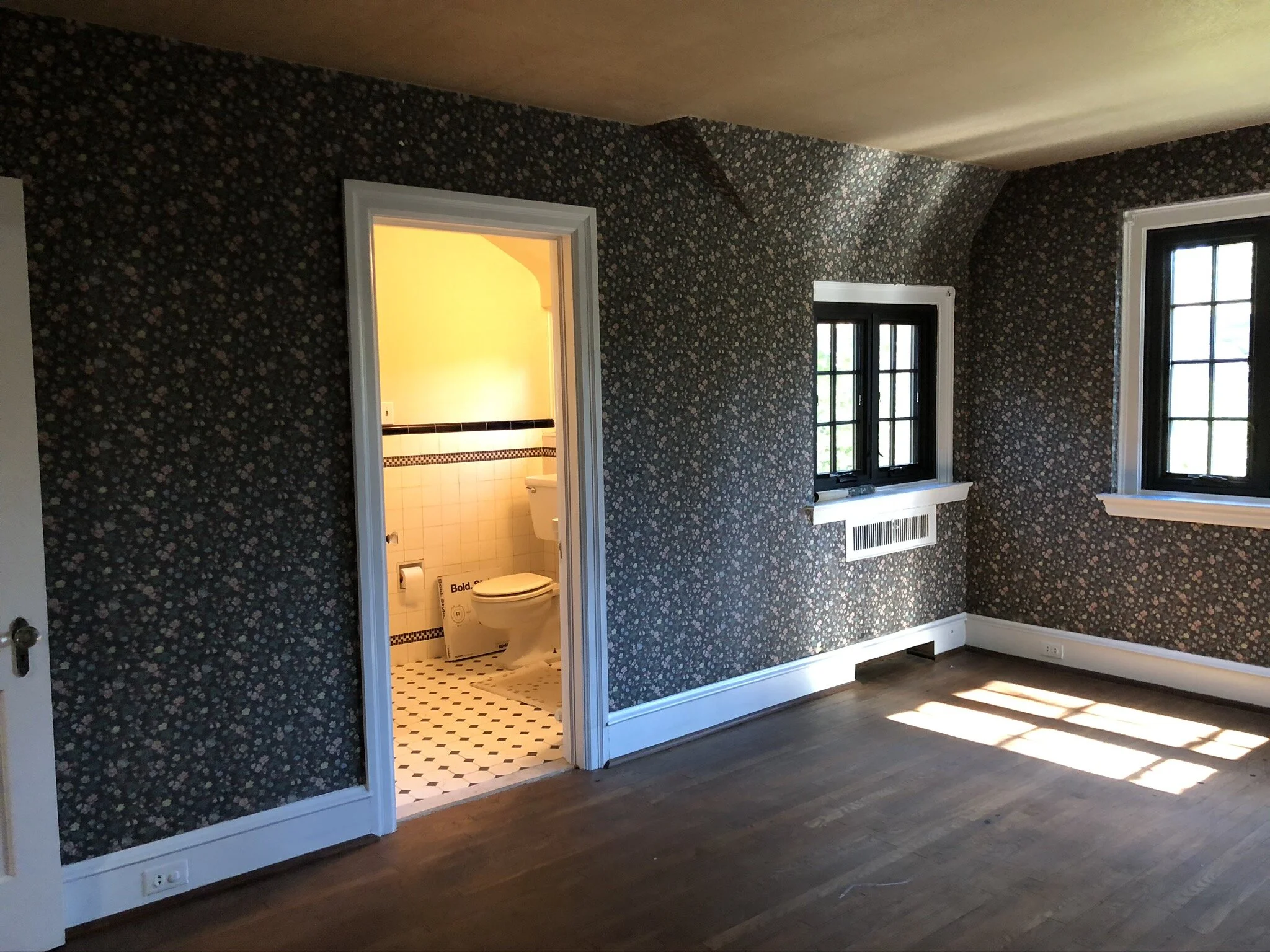


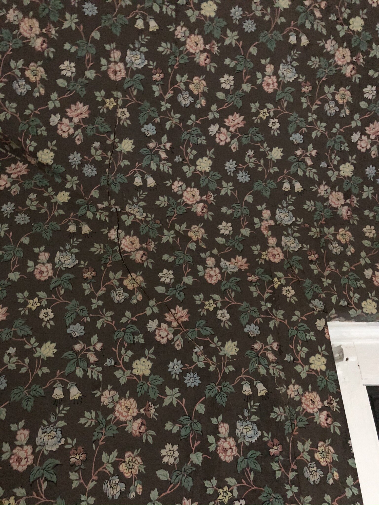
Henry’s room was wallpapered on the ceiling (gold botanical print) and the walls (hand-painted black floral print), as well as lining paper in the closet. Due to what we think was very bad water damage from the old windows, the paper was in awful shape by all 3 windows, with plaster cracking below, and the paper was starting to peel elsewhere too. The ceiling had strange stains all over it, some of which we thought were smoke stains. We believe a smoker lived in the house at some point due to various yellow stains all over every ceiling. And every closet was filled with must and dampness from who knows how many years with the same lining paper. If this had remained a guest room, we might have attempted to restore the wallpaper on the walls at least, but it just didn’t make sense for a toddler’s room. Unsure of how long the wallpaper was going to take to remove and having horror stories about it in the past, we opted to hire a contractor to get it all off for us, figuring time was worth the money. So this is cracks, the paper, the process and then the much brighter(!)blank state they gave us:w


Then while we were working in the kitchen, we found out we needed to get the whole house re-wired as many of our light switches were starting to fail with the 1920s fabric wiring which was deteriorating and many of the wires fraying. So we took this opportunity to modernise a tiny bit as well and add in some overhead lighting to a few spaces, notably bedrooms, which had very little central lighting. Growing up in the UK, we have always favoured simple recessed spotlights over singular central light fixtures, as they are more subtle and cast a warmer glow to the space. Additionally, when they are not on, they do not detract from the overall design aesthetic of the room and keep the home’s historic feel intact. Henry’s room only had one sconce (see pic) which was not working, so we swapped out the sconce for something with a little more pizzazz, added a second sconce and installed 4 simple spotlights on a dimmer. So now we are here and this is the state we started from this week:


THE CHALLENGES
(1) Plumb, what’s plumb?! As with any old house, despite a room LOOKING pretty square and level, it is highly unlikely that it is. As we started measuring and checking for some panelling that we want to put in, we have discovered that the room dips by almost 2”, but not in the middle – at either end. So the floor is actually more like a bell curve, weird eh? Every floor in our last 100 year old Atlanta farmhouse dipped in the middle, so this threw us for a loop for a while! We’ll share more pics next week as we went through the paneling process!
(2) So. Many. Features. Don’t get us wrong, we absolutely love every single feature in this house and we are trying our very best not to change any of them. But it certainly makes it interesting to design around! In this room, we have three windows with different depth sills, one is 15” depth and two are 3” depth. What’s the problem, say you? That’s a cool place to put a vase, you say. Why yes! I agree, but it makes things like roman blind placement an interesting conundrum. Do you place them on an outside mount for the shallow windows and then inside for the deep sill? Do you try to mount all three inside? Do you mount the deep sill near the window or near the wall? So many questions, and I don’t have those answers yet! Another feature connected to those windows are the steam based radiators, which are hidden in the walls beneath most windows. Again, really cool, until you need to figure out furniture placement that doesn’t put a nice velvet chair right up against a radiator, or to figure out how to edge your panelling when it meets the metal radiator cover. Don’t exactly have the answers there either… so TBD.
(3) Doors, Doors, Doors. 3 precisely – one on each wall. I guess probably pretty normal, but the door to the bathroom sits directly opposite where the crib/bed will go. And no one really likes to stare at a toilet when they’re in bed… We think we’re solving that one with a bathroom layout change come late-summer. Secondly, the closet door swings open onto the only other wall with a decent amount of usable space, so the sconce has to sit in the middle of the wall which is a bit unusual and makes standard picture hanging more of a challenge. We planned to put our existing chest of drawers on that wall as well, and I kid you not, there’s only one spare inch when the closet door is open. Phew!!
(4) The Plumber’s Butt. As Stu has so kindly named it. There exists a panel in the wall at the moment which provides plumbing access to the bathroom behind Henry’s room. Fantastic for if we have plumbing problems and for when we want to redo that bathroom (which we will need to next year), but we didn’t feel that the existing treatment making it look like a tiny door complete with trim to match all of the other doors was quite right, it looks like it was built for a gnome, or an oversized and still hungry cat. We want it to still be accessible, but to blend it in with the walls a little more. Luckily, our panelling idea will let us do that.


(5) The Design. We’ve grown up now (I think?!), and after having lived in many homes where we never fully placed our stamp on the house, we decided THIS is the house where we’re going to do it properly. So we’ll be spending a bit more than we have in the past to put in nice curtains, have quality bed frames, pick the better wallpaper, etc. When it comes to the kid’s rooms, we want the same – but of course, children grow up and change their minds frequently, so we don’t want to waste hard-earned money on quality pieces that they won’t like down the road. Therefore, the goal for the design is to be whimsical enough that a 1 year old loves it now, but classic and simple enough that we can swap out a few things here or there that 10 year old or 15 year old Henry will still love it too. A little inspo reminder:


THE PLAN – Layout, Design & Flat Lay
Henry’s room layout is pretty simple and straightforward – there’s only really one wall to put the crib on without doors / lights / etc being in reaching distance. So done - can it all be that easy??! I wish!! The chest of drawers could fit under the large window, but we felt that was a better use of space for a new, large and comfy chair instead, along with sourcing an antique pine chest to use as a toy box. The chair will sit about 12-18 inches out from the radiator, to ensure that the fabric isn’t damaged by the steam and heat. It’ll fade in all the sunlight, but we’ve chosen a durable performance fabric to minimize the wear. We taped out a few options on the floor to figure it all out, but the many features of the room make it very easy to decide!


The plan is to panel a little over half the height of the walls (51” to be precise from baseboard to cap), with a bull-nose edge at the top that will act as a picture ledge. This style is common in British homes, and below are a couple of example photos. We are adding cove molding to the interior of the squares to add a detail that is seen throughout our home, on the old Tudor style doors, the trim on the window interiors, and matches the general curved shape of the baseboard caps too. The goal is for the trim work to be classic and timeless, but to bring added character to the room (because it so needed it right?! Ha! #sarcasm). The main reason for adding this is balance - the wallpaper we selected for the top half is intense and busy, and we didn’t want to overpower the room by going full height. One of my inspirations from a Scottish hotel (left) also demonstrated that the half & half approach provided much needed cohesion. In terms of paint colour, we’ll be balancing there as well opting for a lighter putty on the paneling to balance the dark navy of the wallpaper and furniture.


From there, the design is all about layering texture and complimentary pattern to create an enveloping, cozy feel - using traditional Scottish patterns like plaid and herringbone, and traditional British textures like pine wood, linen, velvet, brass and wool. That said, there are still lighter blues, greens and ivory emulating Henry’s light complexion and eyes, and fun child directed elements - polka dots, animals with glasses, wooden toys, baby blankets, artwork with trains and castles, and my grandfather’s original Hornby train set for (high up) display. The overall goal is the vibe of a boutique Scottish hotel sitting at the edge of a loch, with an added sense of child-like whimsy that you’d never see in a hotel.
I’ve opted not to hand-render the room (I sketch for fun!), or reveal too much of the space in the form of a mood board, rather waiting for the big final reveal instead. I do have many mock-ups which I’m dying to share, but I’m so excited that I’d like this to be a bit more of a ‘wow’ reveal (I hope!). So in lieu of those mood boards with all the elements, I’ve pulled together a flat-lay with some of the more tangible design pieces I had on hand. Not my best work I’ll admit, but I’ve only got these bits with me at our temporary accommodation while the rest is at the Tudor.

And finally…
THE TO DO LIST (the easiest of all 3 rooms!)
Measure room
Remove, strip and re-paint radiator covers
Sand windows and doors to remove flaking paint
Order all lumber for paneling
Order wallpaper
Order new chair
Order roman blinds & curtain rods
Install paneling (more than 500 cuts… ahhhhhh!!!!)
Build out spaces in paneling due to level issues
Wood fill & sand paneling
Prime paneling & walls
Caulk all panelling
Paint paneling, walls, ceiling, doors, trim & closet
Sand & re-paint shelving in closet
Install new rail in closet
Source trim for existing curtains
Add trim to existing curtains
Source antique pine toy chest
Source antique side table
Source rug?
Install wallpaper
Source & order frames and artwork (based on wallpaper)
Order cushions
Install curtain rods, existing curtains & new blinds
Hang artwork
Get carpets installed (please don’t @ me about this! There is a good explanation! And they will be reallllllly nice)
Move all furniture to house
Style & photograph!
So with that, I wrap it up for this evening while I head off to read everyone else’s blogs (check out the links below) and say adieu until tomorrow when I’ll be back with Aemelia’s room kickoff (really the room that launched a thousand rooms!). If you’ve even read this far, then thank you! Glad to have you around and joining along for the fun - if you don’t want to miss a blog post about the transformations, then please be sure to subscribe to the blog below to get the notifications.
Love & Cuddles,
Lex

IMPORTANT LINKS:
One Room Challenge sponsored by Better Homes and Gardens.
Featured Designers for April 2020:
A Glass of Bovino | Beginning in the Middle | Beth Diana Smith | Clark + Aldine | Coco & Jack
Deeply Southern Home | Design Maze | Dwell by Cheryl | Erika Ward | Home Made by Carmona
House of Hipsters | Hunted Interior | Kandrac & Kole | Kate Pearce | Katrina Blair | Liz Kamarul
Veneer Designs| Rambling Renovators | Renovation Husbands | Studio Plumb