
What on earth is a Burnham Overy? ORC Fall 2020 - The Parlour Wk 4
A. A Paint Colour!
Once upon a time, I painted our first ever owned kitchen a pale grey/blue (6 years ago…). And then the dining room was dark blue (5 years ago). Then in our next house, I wallpapered our bathroom in a big bold blue Serena & Lily pattern . And then in this house, I took that effect even more over the top, deepened the blue and chose the biggest room of the house. Let’s just say I have a thing for blue paint and dramatic settings. So as we finish up Week 4 of the One Room Challenge, this week has been all about paint (and a little wood stain).
New here? Ello! Welcome! Lovely to have you. Haven’t met Ginny yet? (the house) Learn about her here. About me? I’m a Jane of all trades - full time marketing consultant, part time architectural illustrator, interior design hobbyist, power tool enthusiast who will always advocate for women who build their own stuff. Want to catch up on earlier weeks? Week 1 .. Week 2 .. Week 3. I also share A LOT on Instagram (@brooksandstone) if you’d like to follow along with more day to day fun times.
I know, I’m supposed to give you a peppy talk about how exciting this all is (and it certainly is to me, who’s been waiting over 9 months to put colour on these parlour walls), but in reality not that exciting to read about for you. After all, I’m assuming at least 50% of you have painted a room before. So I’ll stick to my favourite things about the British paint company I use (none of which I am paid or sponsored to say), and some pretty pictures. I was SO tempted to not put these photos up yet in colour, but I have the non-existent willpower of a 2 year old (in-fact my own 4 year old probably has more willpower than me….), so here you go.
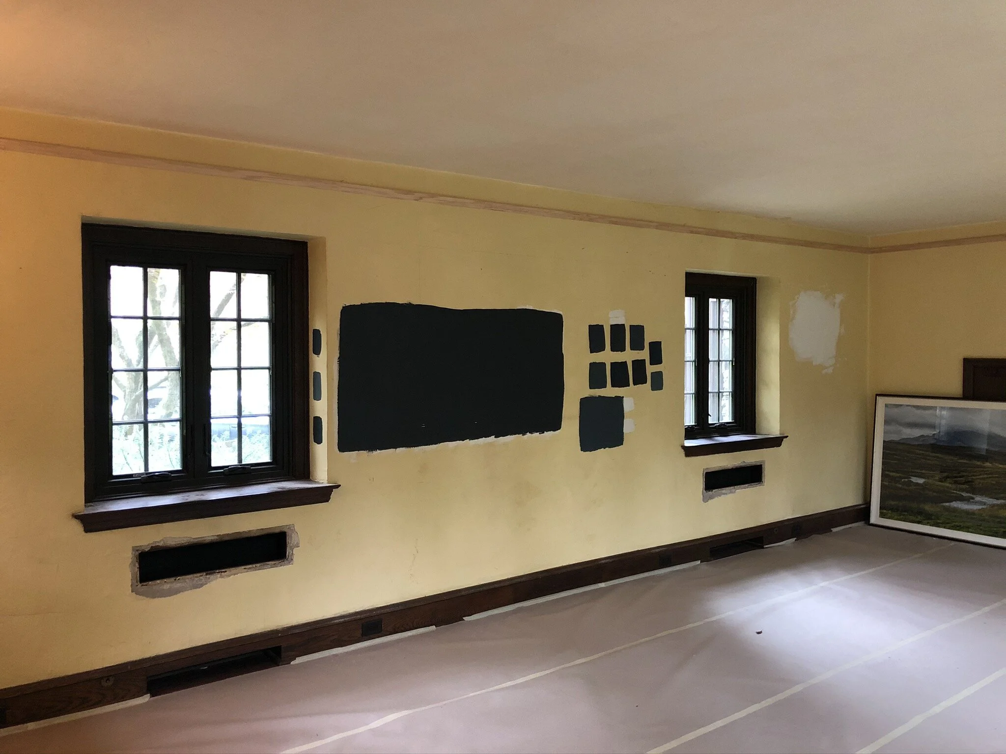
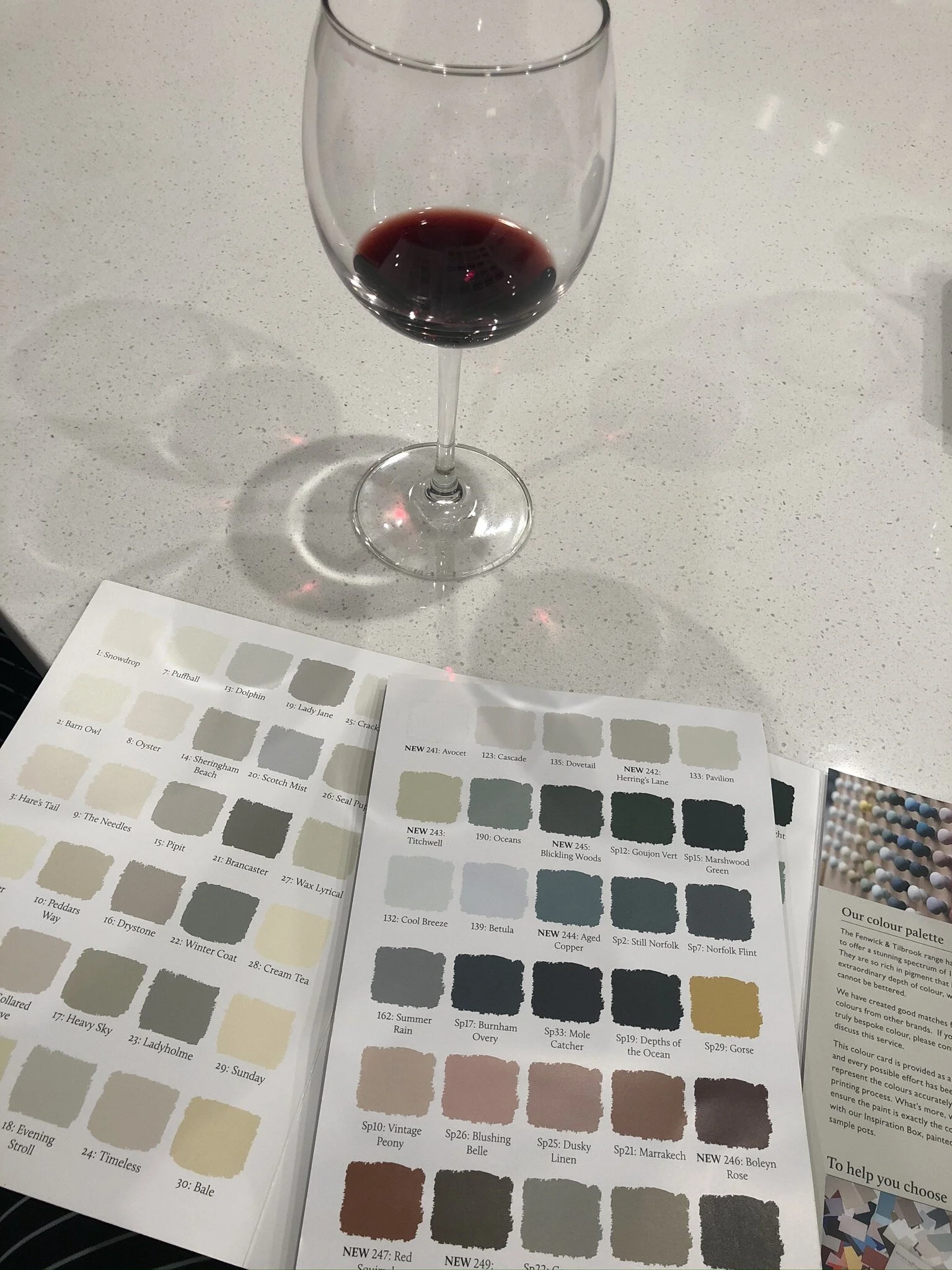
The parlour is a grand room, that deserved a grand paint colour. I originally channelled my drama and thought I’d be going super dark with a blue/black colour from another company. But I had a swatch of that colour painted on our biggest wall for 6 months, and neither of us were feeling it by the time we got around to ordering the paint. Anyone who’s followed us for a long time, knows that we live with paint swatches for a healthy period of time before committing, we rarely change our minds from our original chosen colour but in this case, we’re so glad we did for once! The first reason was the original paint swatch (“Railings” by Farrow & Ball) although it changed from a deep blue to a dusky black throughout the light phases of the day, just felt like we were staring into a black hole when it was overcast or dark outside. So we wanted something warmer (an interesting conundrum when you’re playing with blues), that enveloped you in colour, but yet still had dramatic moodiness that leant an historical air. It was a tall order. The second reason we changed was because I had already started trying out Fenwick and Tilbrook paints in a couple other rooms, and immediately fell in love. It seems bananas to most that I order from across an ocean, but honestly their paints are like nothing I’ve ever used before. (Again reminder, not sponsored, not been asked to say any of this – but they do give me basically a shipping discount) Thick paint that doesn’t fall off the brush, incredible coverage, low VOC (they actually smell nice?!), and go on like a silky butter dream whether you’re using a brush, roller or sprayer. Plus, their colours are superb! We have found in this house the light mix is very odd, lending a gray over-shadow to almost every room that washes out a lot of paint colours (particularly the non-natural pigments of Sherwin Williams, Benjamin Moore, etc). Whereas, the Fenwick & Tilbrook colours have a lot stronger natural hue (due to more pigment) – regardless of whether you’re picking a neutral beige as we did in Henry’s room or the blue we’ve picked here.

But I’ll come back to the many reasons I love this paint in a minute…
Prior to painting we had a very short debate about whether to paint the picture rail and ceiling in the same colour - there are many people out there who swears that it visually makes the ceiling look taller and is the better option (I generally do agree for the record). I read a very interesting blog post here about it all too. But ultimately, we decided that we wanted the more traditional look, and even though we have short 8’ ceilings already, the room feels rather cavernous in it’s current canary yellow format, so we are not averse to it feeling more like a cozy den if the picture railing and white ceiling does make it feel smaller - that’s actually a good thing for us in this situation.
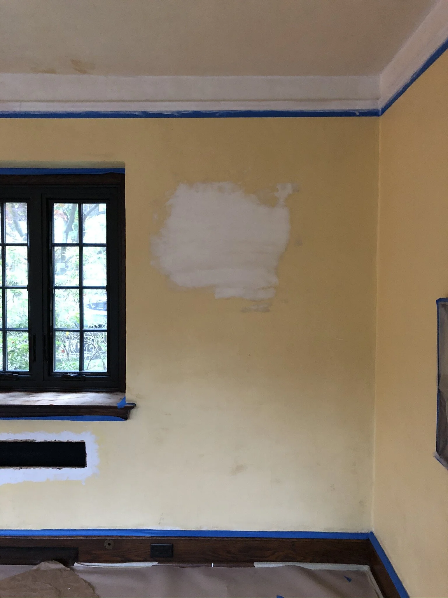
We also opted to prime the walls with tinted primer (my first time using a tinted one!) as there were multiple plaster patches from all of the prior electrical work, lots of other paint samples to cover, and this yellow seems to colour-bleed more than others so being safe rather than sorry that our final colour is the colour we pick! Plus it helps ensure the paint adheres well and we get more longevity.

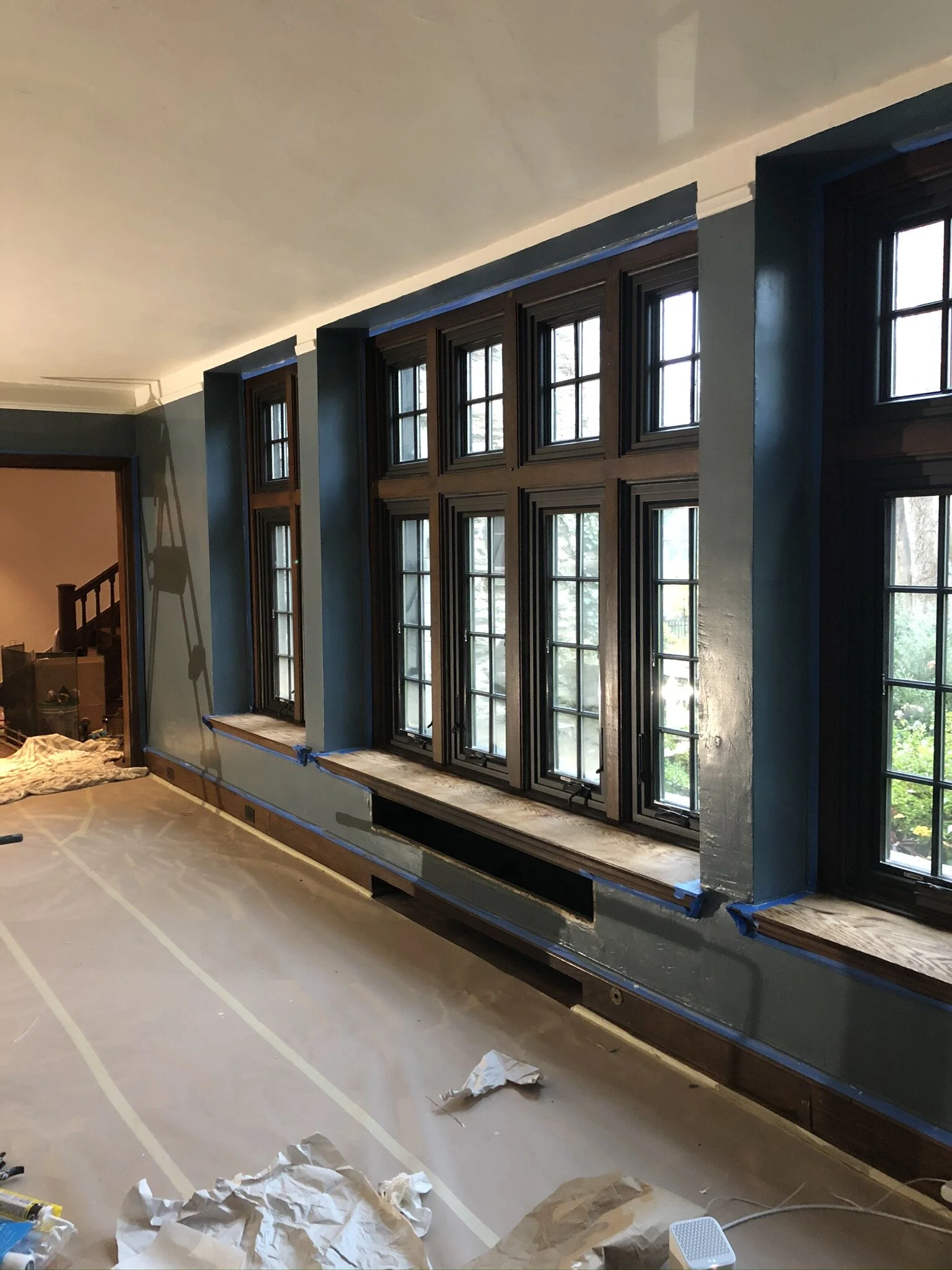

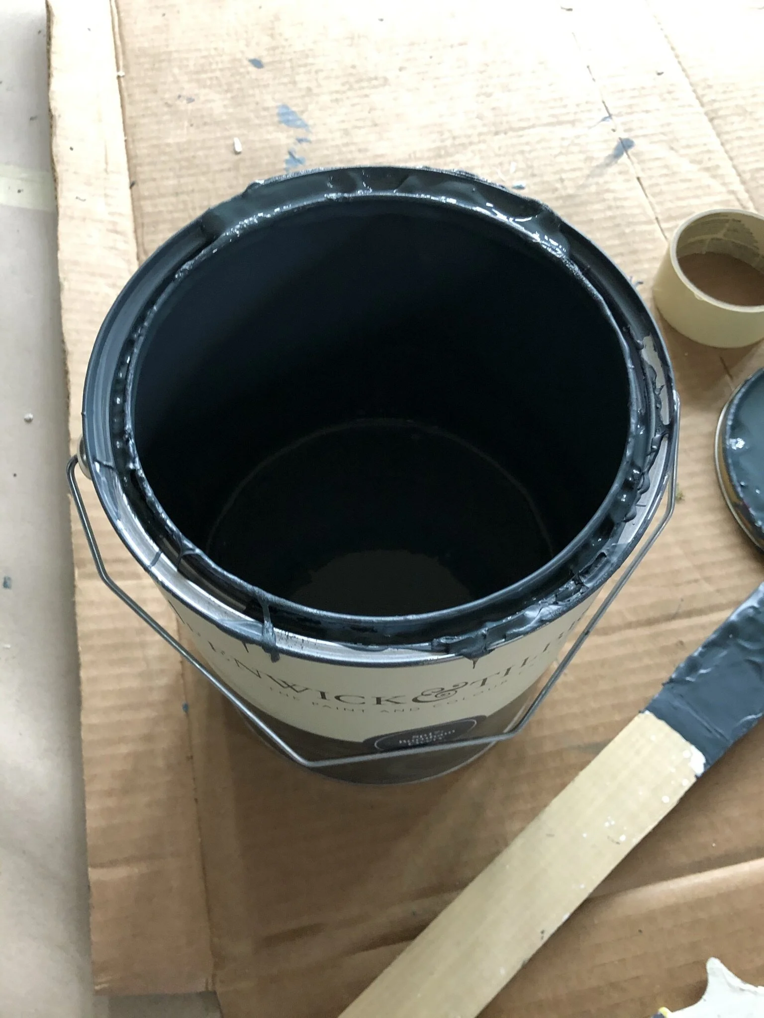
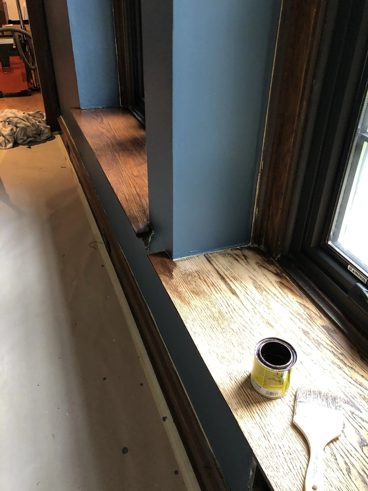
With that… I give you the pretty reveal picture of the parlour finally fully painted!! TA DA! We chose a slate blue “Burnham Overy” for the walls, and “Oyster” which is a light cream with pinky undertones. Both were painted in the “Pure Matte Plus” finish which is a wipeable, durable matte as with the heavily textured walls, we didn’t want to be seeing every divot and plaster stroke highlighted with any sheen. Burnham Overy changes from a soft blue in bright sunlight (our afternoons in the South facing side), to a dusky charcoal blue during heavy rains, the morning light and after dusk falls, and we LOVE IT TO PIECES. Even Stu who is a man of few over-the-top exclamations walked in and said “Oh my god, it looks amazing”. We just cannot stop staring.
And just a little reminder where we started from if you click to the right in the gallery…


All the reasons I order paint from across the pond – and you should try it too!
It’s a small business, run by a family. I know I’m talking to Anna on social media, who is so genuine and lovely. I phone and immediately recognize Simon’s voice. They know me even after 3 short phone calls and a few social messages, and greet me as a friend. Nothing compares to that sort of service, and despite four times more visits to my local Benjamin Moore store, I don’t get service anywhere near as personal.
Turnaround times (esp if you’re in the UK) are incredible (2 days there), but even internationally I receive all of my paint in no more than 7 days. Perfectly packaged, never damaged and in their lovely tins. No customs concerns whatsoever. I’m 3 orders in at this point, and haven’t had a single issue.
The quality of the paint – thickness is unmatched, even on a roller painting the ceiling I didn’t get paint splatters everywhere, didn’t drip off the paintbrush, etc etc. The coverage is equally unparalleled, one coat easily covers any shade underneath, and one gallon / 5L tin covered an entire 500 sq ft room with two coats with some leftover. Any other paint company would have taken at least 2 gallons.
Second in the quality category is the durability – I’ve used light colours and dark colours, pure matte plus (a wipeable matte) and interior eggshell paint, and I’ve yet to experience any scuffing whatsoever.
The colour selection is just beautiful. With over 200 to chose from (a very wide selection for such a small company), it is an impressive range. I think I’m very drawn to them because they are all borne out of nature – for example their current range “the countryside collection” is lovely creams, beiges, greens, blues and pinks, and they describe exactly what inspired the name and colour. As I mentioned earlier, their paint is naturally pigmented which means it is more dynamic in its colour range compared to anything synthetically created with chemicals (all SW, BM, Behr, big box store paints…). There is a reason naturally pigmented paint costs more and it’s worth every penny. Many will say “Oh I just colour match at the big box store…” which I whole-heartedly disagree with, it’s just not possible to match it. But I will write another post another day all about that. Suffice to say, if you’ve ever ordered real Farrow & Ball paint before, you should absolutely 100%, without a doubt order some Fenwick & Tilbrook next time, whichever side of the pond you’re on.
My creative juices were flowing as I write this and for some unknown reason, I decided to write a little limerick about them. If you’re not aware of what a limerick is, I refer you to a particularly funny scene from Bridget Jones’ Diary.

An Ode To Fenwick & Tillbrook
Once there was a paint co in Norfolk
Before better known for a Broads soak
They open their tins
Pour paint with their gins
And say “Go on mate, give it a stroke!”
Norfolk is incredibly hard to rhyme with, but that was fun. Anyway, moving on.
Once all the final touch-ups were done, I then stained the windowsills back to their original English Chestnut with two coats of Minwax (reminder I sanded them down last week due to water damage, mold and varnish cracking), and will be finishing them off with Danish Oil next week. We then finally removed the paper protecting the floor, gave the floor a little mop with Murphy’s soap and laid down our beautiful new-to-us (but very old) Persian rug from Woven Abode (again a discount was given, but no requirements to tag).

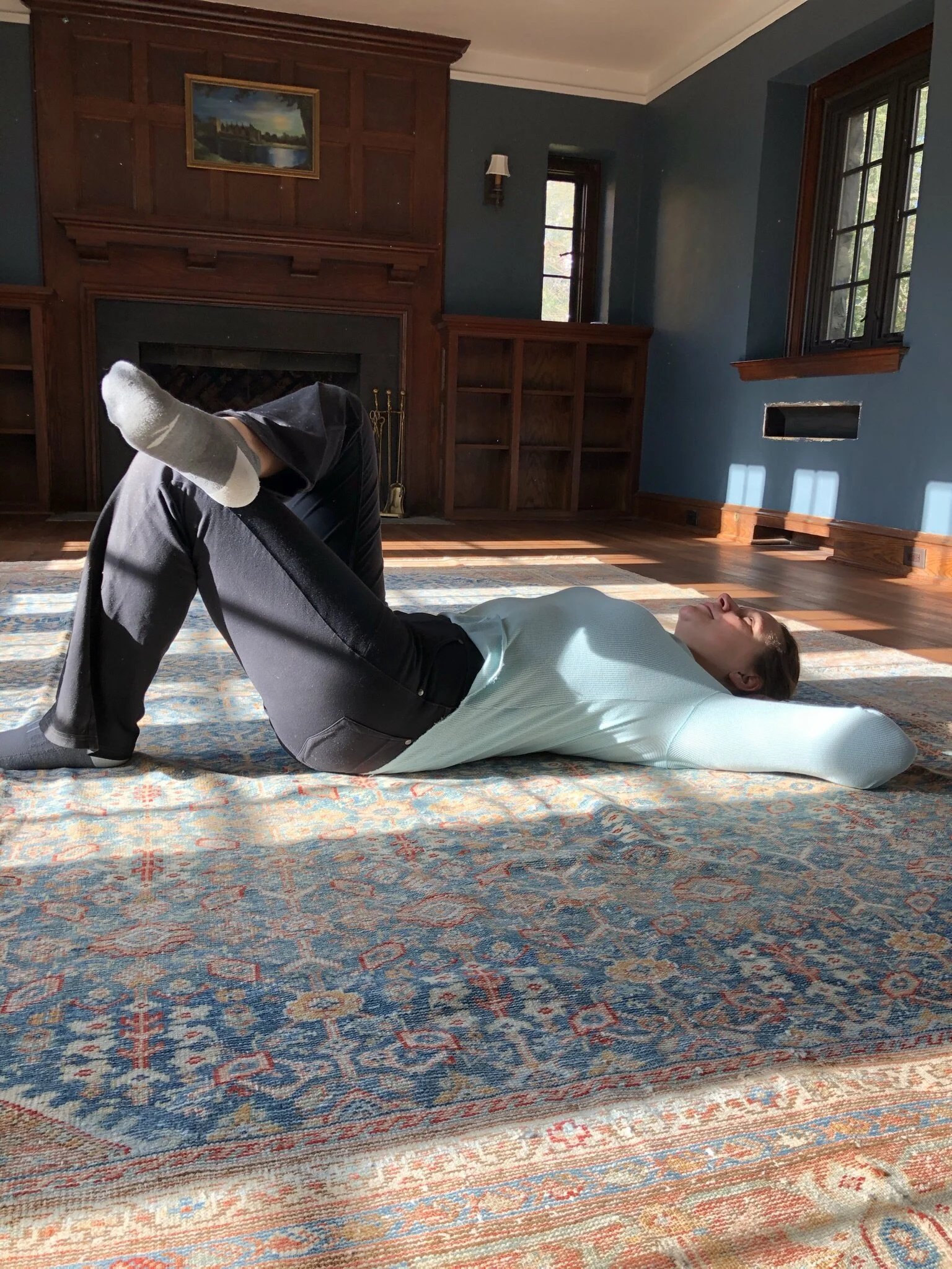
And that was the end of this week! What a week! There’s still a few things to get done on the to-do list – cleaning all the brass hardware for the fireplace, getting our kid’s new bookcase (built last week) and their desk painted, re-painting the fireplace brick in firesafe black paint (it’s all come off after many years), figuring out what curtain fabric I want to pick (I’ve changed my mind a thousand times here…) and ordering the curtains, and then Oh yeah that small MOVING IN thing. You know, just a quick weekend task right??! As usual, follow along on Instagram stories for all the daily progress in this room and all of the others!
Love & Cuddles,
Lex

Better Homes & Gardens is the official media partner of the One Room Challenge
This season’s featured designers are making over virtual spaces at Highpoint Market - check them all out below!
Albie Knows | Ana Claudia Design | At Home With Joseph | Barbour Spangle Design
Dwell by Cheryl | Eneia White Interiors | Gray Space Interiors | Haneen's Haven | Hommeboys
Interiors by Design | Jana Donohoe Designs | Laura Hodges Studio | Lauren Nicole Designs
Nicole White Designs | Nikole Starr Interiors | Nile Johnson Interior Design | Prudence Home + Design
Thou Swell | Traders Haven Design | Whitney J Decor | HPMKT