
Let’s Get Colourful - The Boot Room
Once upon a time… we started our 3rd One Room Challenge “Boot Room” space, and today marks week 2 of the 8-week event. Last week (catch up here), we shared the befores, the current challenges and “issues” that we’re addressing, some inspiration images and a preliminary black & white moodboard. So I can only assume you’ve all been refreshing this blog for a week solid waiting for it in COLOUR! Right?! I’m going to just keep thinking that, so please let me dream.
Today, I’m here to deliver on that promise with not one, but TWO colourful moodboard, an extra flatlay because I randomly created it one night on a whim, and some SketchUp models. I hadn’t intended to share the latter, but I’ve spent hours creating them and one day hope to offer this service up to others who need it – so why not!! I’m happy to report that everything “big” or coming from afar (aka England) that needed to be ordered has been done, so now it’s up to the gods to determine if the packages arrive on time for the reveal. I’m going to be extra hippy, manifest the sh*t out of this with optimism and say it’ll all be perfect 😊
New here? Ello! Welcome! Lovely to have you. Haven’t met Ginny yet? (the house) Learn about her here. About me? Lex. I’m a Jane of all trades - full time marketing consultant, part time architectural illustrator / designer, interior design hobbyist, power tool enthusiast who will always advocate for women who build their own stuff. I’m English (though now living in Philly), sarcastic as F, love a well-timed swear word, and am also mum to two rambunctious little ones (aged 4 and 2), with another one on the way (due in Sept). The hubs, Stu, gets involved too and we tackle most projects together as we balance out each other’s momentary stupidity as we go. We believe in sharing the good, the bad and the ugly about every project, but especially like to take on big challenges and things we’ve never done before. And for those projects where we had to learn A LOT… I often write big meaty blog posts about the process and results, like renovating our kitchen, rewiring our house, painting cabinets, etc. If we do something sponsored or partially discounted, it’s rare, it’s honest, and you better believe we’ve spent months or years researching it first. We share quite a bit on Instagram too @brooksandstone if you’d like to follow along with more day to day fun times.
So before I reveal the full mood-board, I’ll give a little background on the space I’ve always had in a my mind to create. My goal with every design and/or room is not to just to create something pretty, but to evoke a FEELING. In the parlour, I wanted a moody, rain feel (without the actual wetness) that feels like you’re sitting in an incredible Scottish storm a few centuries ago but with a nice cup of tea. In our son’s room, I wanted whimsical fantasy that inspired imagination and animal play as if in the turret of a castle. In our daughter’s room, I wanted her to feel like she was frolicking in fields of lavender in France, one amongst the flowers and nature, with bees buzzing about. And in the boot room, since it’s the main entry point to our home (the front door closest to the driveway) for both us and guests, I wanted it to feel like a warm, enveloping hug… or like a whiskey warming the cockles after a long winter’s hike in the Highlands… or like walking into proper English pub complete with dingy red carpet that just invites you to tell all of your life tales.
So without further ado, here are the full-colour mood-board(s) you’ve all been waiting for! Why two styles? I dunno, I like playing and am figuring out my happy design place still. Would love to know which one you prefer?!

Let’s start with what colours we picked and why. For anyone that’s new, you’ll come to learn that I’m one of those odd ducks who actually loves picking paint colours, and I’ve been told I’m pretty decent at it. In this historical house, I embrace all the deep bold drama that it can hold (which is a lot). A few factors went into picking the boot room colours, but there were also a few a-ha moments that led me down a specific path as well.
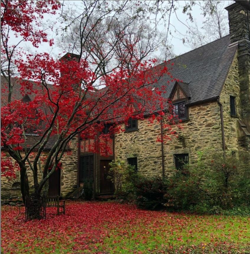
1 // Outside the room, we have our gorgeous red Japanese maple which practically glows between shades of purple to red, and I can literally spend hours watching from our bedroom window during a light wind storm.
2 // The exterior of the boot room corner of the house is clad in a phenomenal mix of patterns of red brick and half-timbering.
3// Sorry no pic for obvious non-stalker reasons….out of the window of the boot room, our neighbour has a classic dining room painted, deep red. So who can guess where this is going?!
4 // These two bottles of whiskey. The first, the BenRiach 21-year, which I bought two years ago in my dad’s favourite whisky shop in Knutsford, England where he lived after he died - we drink one glass every year on the anniversary of his passing in memory. And the second, Aberlour Abunadh, which tastes like Christmas and was a bottle that my dad and Stu happily drank almost an entirety of, during one lovely summer evening visit about 5 years ago.
5 // This candle for both it’s scent and beauty: Cerabella Rhubarb & Leaves and this candle for transforming it’s heavy but heady scent into a room design: White Company Highland Escape.
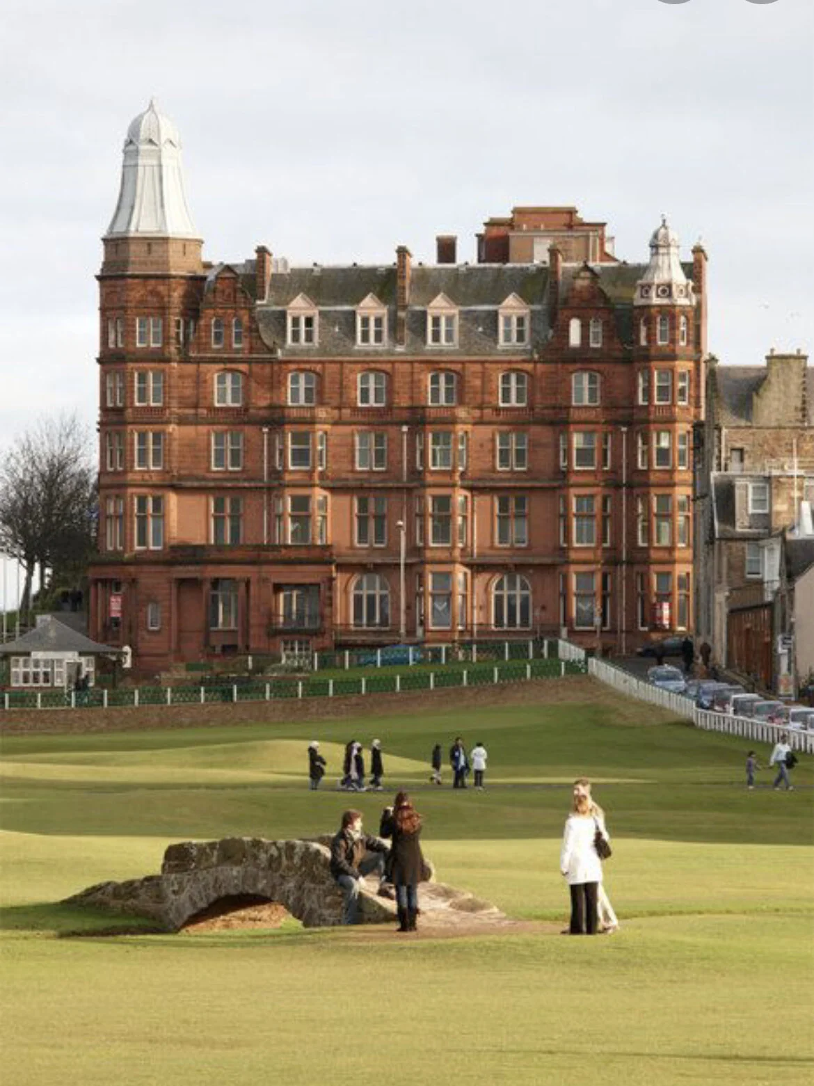
6 // Stu’s former university hall of residence “Hamilton Hall” which has since been turned into swanky million pound flats
7 // I drive past this original 1742 historical red brick house called the Square Tavern almost every day delivering children to and from school, and it all just clicked.


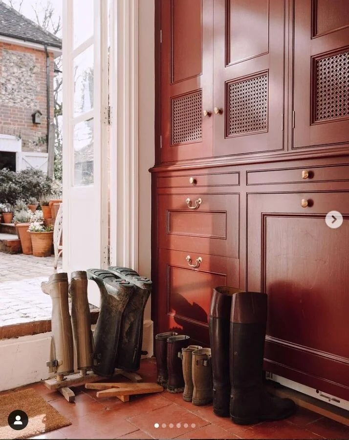
If you read the kick-off post last week and picked this inspiration image from @louiseroehome, you were SPOT ON with the direction we’re headed.
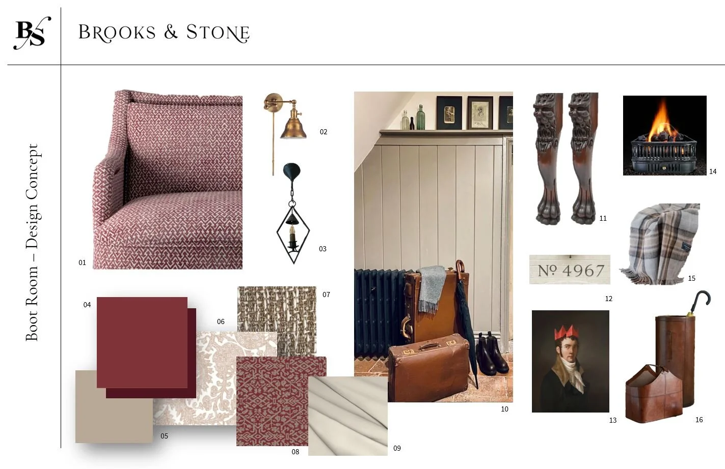
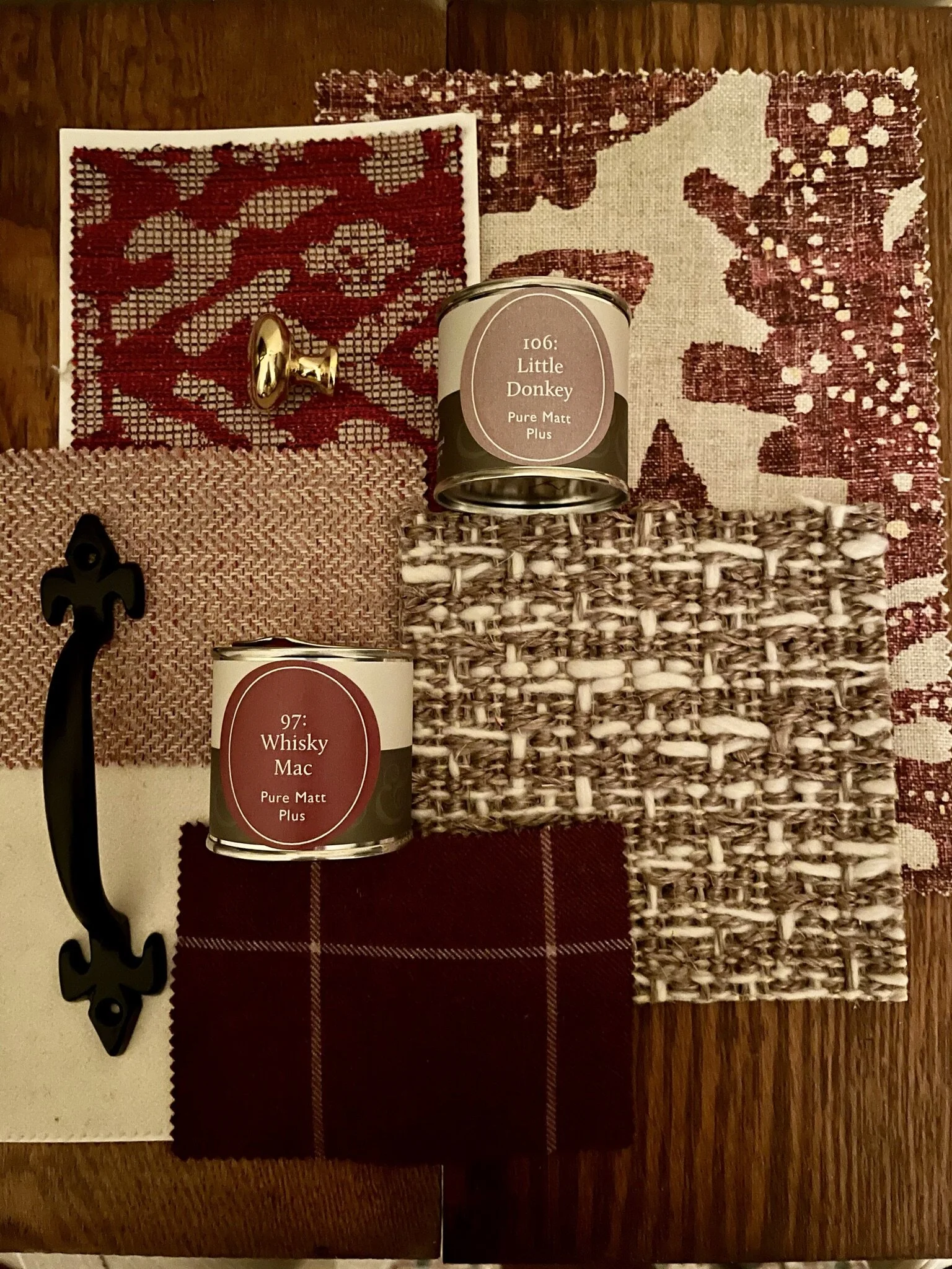
The colours we chose are called “Emperor” mixed at 75%, with 25% “Winter Garnet” as I went rogue to create my own port / ruby red colour and “Little Donkey” (brown with purple undertones). Besides both being awesome colours with a incredible amount of dimension #nautralpigmentforthewin… I also just love the names. I don’t know about anyone else, but if I don’t love the paint colour name, then I don’t typically love the colour. Illogical yes, but true in my case. Both, of course, are from my beloved @fenwickandtilbrook. Full disclosure, I get a discount which essentially covers my shipping costs plus a bit, but it’s not sponsored and I am under zero obligations to write any of this. I just love the stuff, the company and the people so much, and it makes any other paint pale in comparison. I will continue to order from across an entire ocean, and strongly encourage all of you to at least try a sample pot once in your life. Read on here for a post dedicated to the paint company (of my own volition) back in our last ORC space: the parlour (a deep blue, “Burnham Overy”).

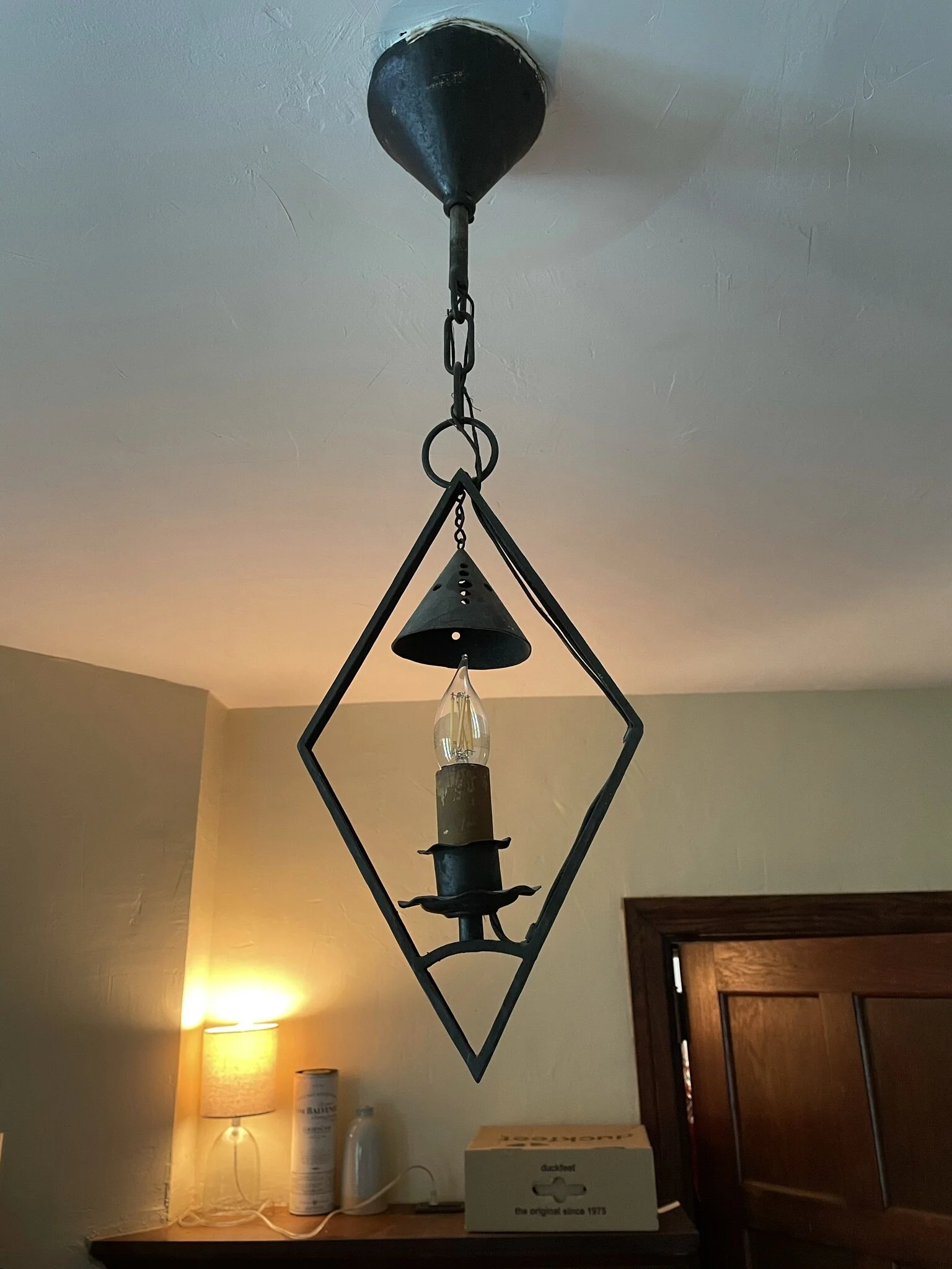
But… we’re going to kick it up a notch and carry the red colour onto the ceiling and into the shoe cupboard, and then all of the panelling will be a high gloss (almost lacquer like finish) in the light brown colour a la my second fave inspiration image from @plainenglishkitchens. This also helps bounce light around the room since it’s so dark (plus bonus, extra wipeable for cleanliness and kid mess). Just after this are some of my SketchUp renderings to help you visualize what this will look like! (Side note: keystone fireplaces on an angle are HARD to do!!)


I’ll be honest, I did struggle a little with deciding how “designed” to make this room feel, as it has so many incredible original features that I didn’t want everything competing with each other. So I’ve kept it simple, allowing a couple fabrics and the colours to do all the talking, but will all be accessorised to the max for a true eclectic boot room feel. (None of which is really shown much in the SketchUp rendering). But of course, I’ve instead focused heavily on the minor details that most probably won’t even notice unless I get them wrong… from the 18th century French oak legs I found (and fell in love with) on Etsy that will form the basis of the DIY bench, to ensuring the new sconces and fireplace inserts matched the historical features of the original fixture without detracting from their needed function, to our new house numbers in a historical style to make sure we get all these deliveries!! It was also important that I select fabrics that could hold up to substantial cleaning but still pack a punch of needed softness due to the minimal amount of textural furnishing in the room.


I’ll delve more into the specific fabric samples, lighting selection (oh my goodness this took me forever!!) and rug decisions next week (while I gear up and wait for all the building materials to arrive), but here is a little flay lay of where that’s headed. Apologies I did make this before I chose the final paint colour (so that’s not technically the right one!).
It’s also with great excitement that I announce this is the first time we’ve semi-partnered with some companies - i.e. we’ve received discounts on their products and services in return for posting about them. As usual though, these are companies I sought out after determining the best items for the space. But without them and the discounts, I wouldn’t be able to bring you lots of stellar information and products from further afield, so please embrace them as you do us!

Further on in this blog series, we’ll be delving into the building how-to’s of our sliding shoe shelves and boot rack, and custom pieces with some models and dimensions, the nitty gritty of our fireplace woes, how to make your own upholstered bench (assuming it goes well), and all of our installations. I’m aiming to make each week something you’ll look forward to reading and informative, rather than just checking the weekly blog post box to say I’ve done it. Let me know I’m doing! So with that I bid you adieu for this mini fairy-tale chapter to go and get on with some serious DIYs!
And they lived happily ever after…. in an empty room, just itching for colour. (Final edit in the the 11th hour of this post going live… the paint just arrived this afternoon and I’ll be getting started very quickly!! EEK!)
Love & cuddles,
Lex
IMPORTANT LINKS:
One Room Challenge sponsored by Better Homes and Gardens
Featured Designers for Spring 2021:
Ariene C. Bethea | At Home With Ashley | Banyan Bridges | Bari J. Ackerman
Brit Arnesen | Brownstone Boys | Cass Makes Home | Dominique Gebru
Gray Space Interiors | Haneen's Haven | Home Ec. | Nile Johnson Design |
Pennies for a Fortune | Prepford Wife | Rachel Moriarty Interiors | Sachi Lord |
Susan Hill Interior Design | This Is Simplicite | Tiffany DeLangie | Victoria Lee Jones